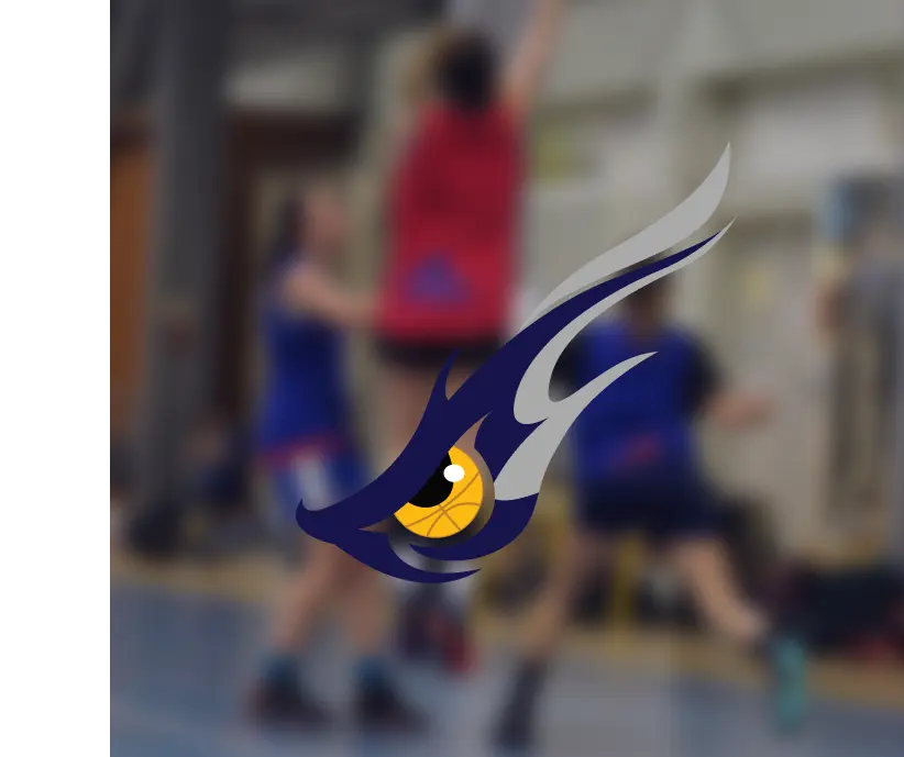
Our client asked for a logo that was going to be used for women’s basketball team. They wanted to portray it as very energetic and strong.
Challenges
It took different concepts to get the right one with perfect eagle eye.
Our Approach
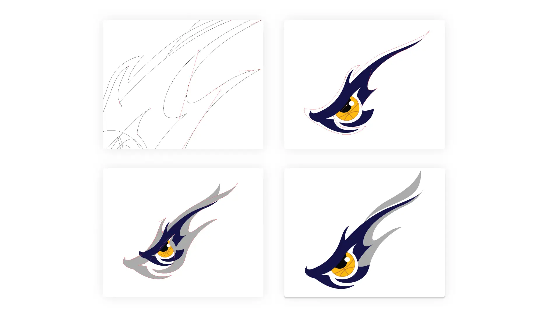
A logo is always an interesting piece to work on. It gives you wings to play with imagination and creativity. We started brainstorming after getting the client’s opinion, then gradually it took a prominent shape when the creativity met with the right purpose.
Color Guide
Typography
Aa
Croissant One
Regular
How it took the right fit
The client wanted to see various designs keeping the primary focus on abstract/subliminal side.
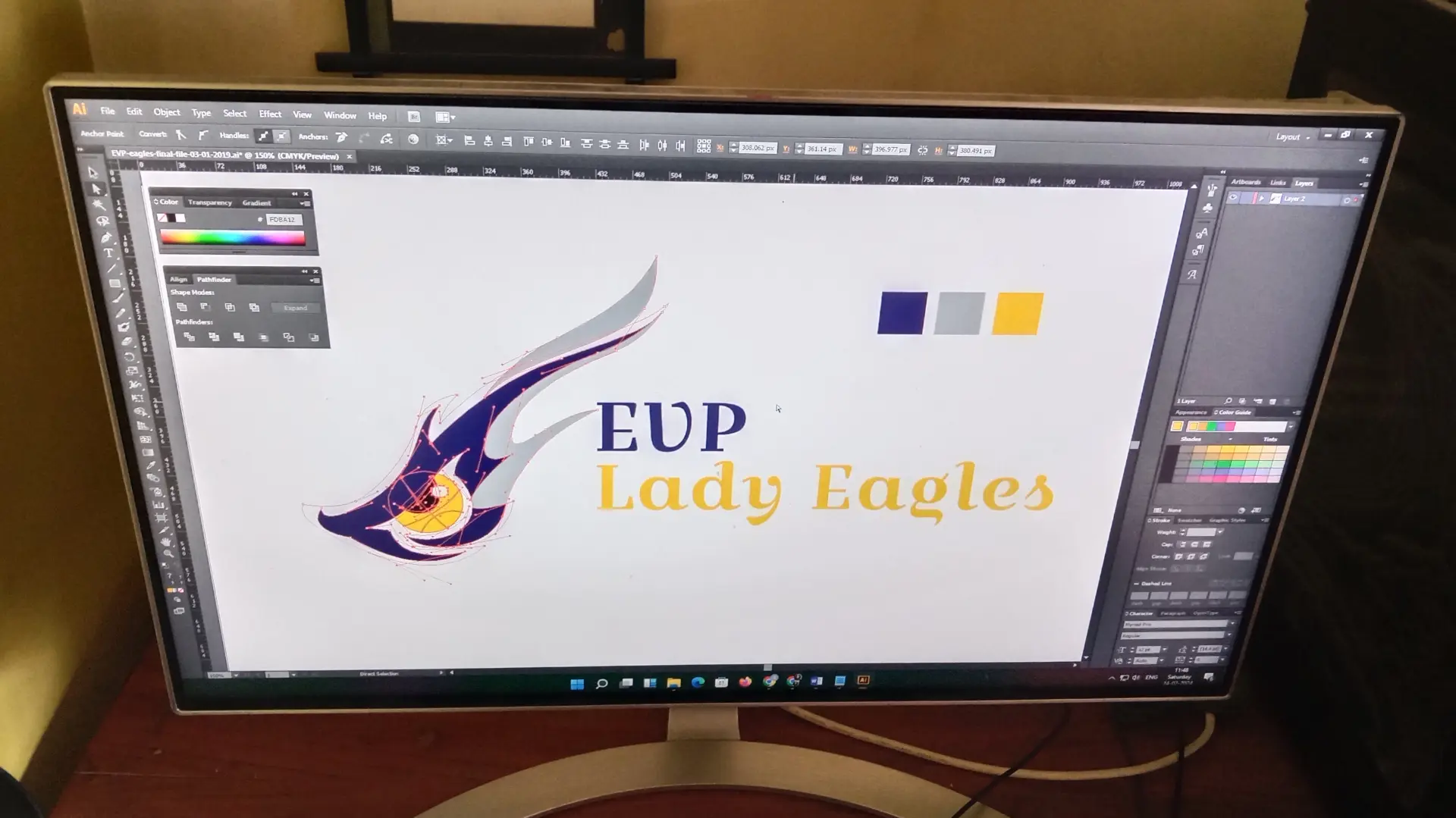
We worked with silhouette of eagle wings behind a basketball. For the text, we used bit more prominent in bold typo so that is pops. So it was really a nice process with Keith, the more he wanted we came with more variation of logo with different perspective, finally it turns out really well.
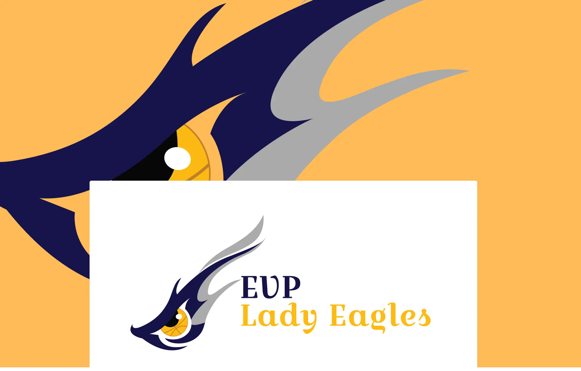
Project final output
We never thought this logo project for the basketball team would be so impactful. The client was happy with the minimalistic abstract logo.
Start to End Process
1
Research and
Planning
2
Rough Sketch
3
Designing
4
Fixation
5
Approval
6
Happy Client:)
Start to End Process
1
Research and
Planning
2
Design
3
Development
4
Content
5
Testing
6
Deployment
Deliverables
Source Files Illustrator File TIFF, PNG, JPEG, PDF