Indian Institute of Technology Kharagpur was looking for a simple logo that reflects trust and reliability and can be used for multiple products.
Challenges
Bold presence with simple clean look for medical use.
Our Approach
It was a very special kind of task when we work on a concept that doesn’t beautify only business but has something innovative to offer the whole mankind. By going back and forth we achieved what we have been asked for and aimed for too.
Color Guide
Typography
Kanit
Bold Josefin Sans
How it took the right fit
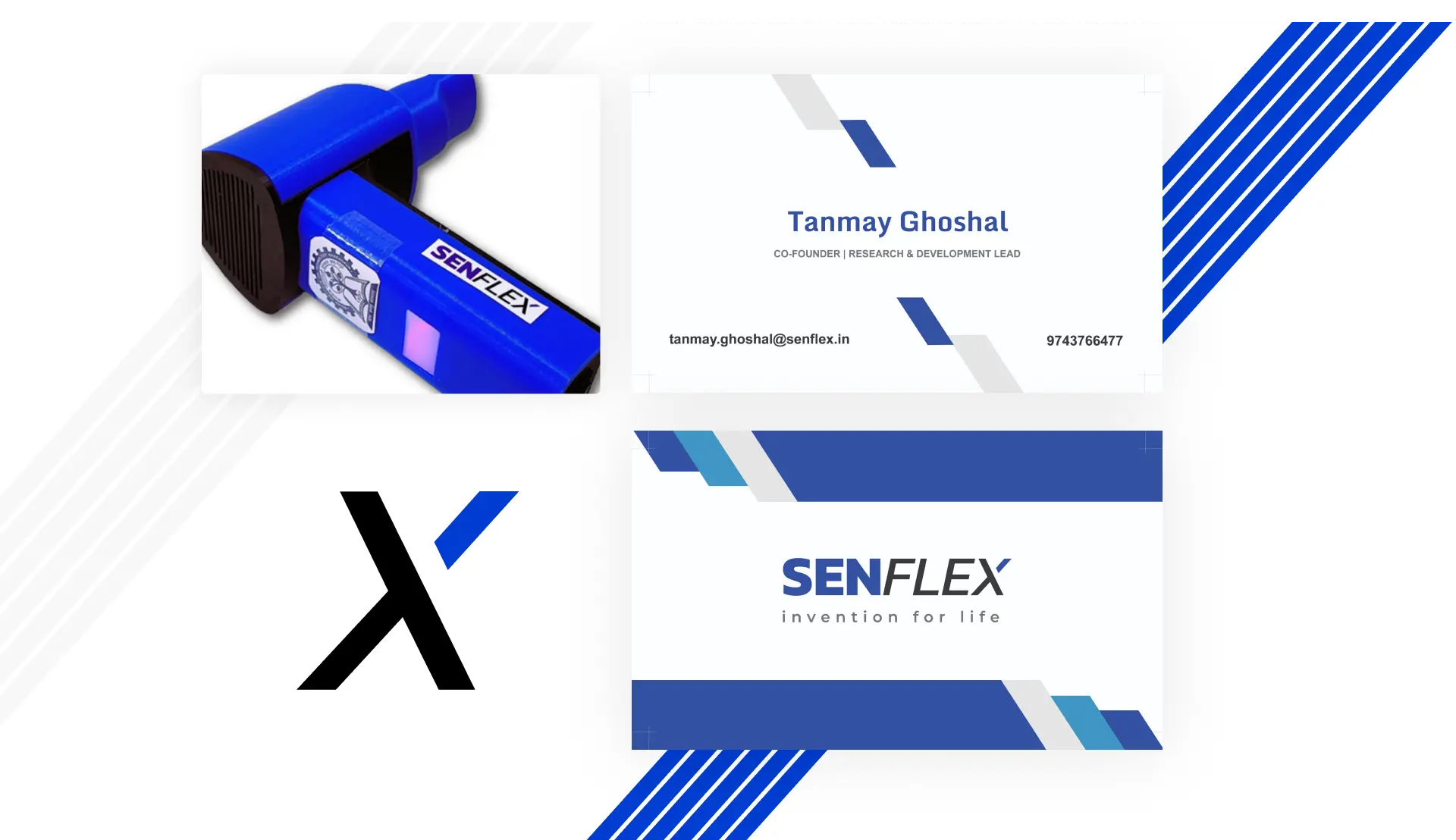
Initially, it was just a typo and mixed of signs, gradually when the logo was developed we found it’s better to experiment with type-based logo as it would give an elegant an professional look. Finally, the typo was twisted and tweaked into a beautiful logo.
Project final output
Property listing for Lease/Rent/Buy, highlighting property facilities, detailed page for each property with info and photo gallery, client testimony for authenticity. Modern UI/UX, easy-to-manage backend, fast loading modern look and feel website, and responsive website all are part of this real estate website building project.
Start to End Process
1
Research and
Planning
2
Visualizing
3
Designing
4
Fixation
5
Approval
6
Happy Client:)
Start to End Process
1
Research and
Planning
2
Design
3
Development
4
Content
5
Testing
6
Deployment
Deliverables
Source Files Illustrator File TIFF, PNG, JPEG, PDF
Colored version Black & White Version
Client Speak
T. Ghosal SenFlex
Happy with the outcome, just perfect for our product.